Mastering Color Theory: A Handyman’s Guide to Creating Effective Designs
Hey there handyman! Did you know that understanding color rules is just as important for creating great designs as understanding how to fix a leaky faucet? That’s right, color theory and the psychology behind it can greatly impact the effectiveness of your designs.
In this article, we’ll cover the basics of color theory and how it plays a role in creating color harmony. We’ll also dive into color psychology and how it can enhance your designs. But it doesn’t stop there! We’ll also explore the importance of color contrast, and offer some tips for breaking color rules and experimenting with unique color combinations.
So if you’re ready to take your design skills to the next level by mastering color rules, keep reading!

Understanding color theory and its importance in design.
Understanding color theory is essential for any handy man who wants to excel in design. Colors play a critical role in the overall visual appeal of an object, and knowing how to use them effectively can make all the difference.
Color theory encompasses several concepts such as hue, saturation, brightness, and contrast. By understanding these principles, you can create designs that are visually striking and aesthetically pleasing.
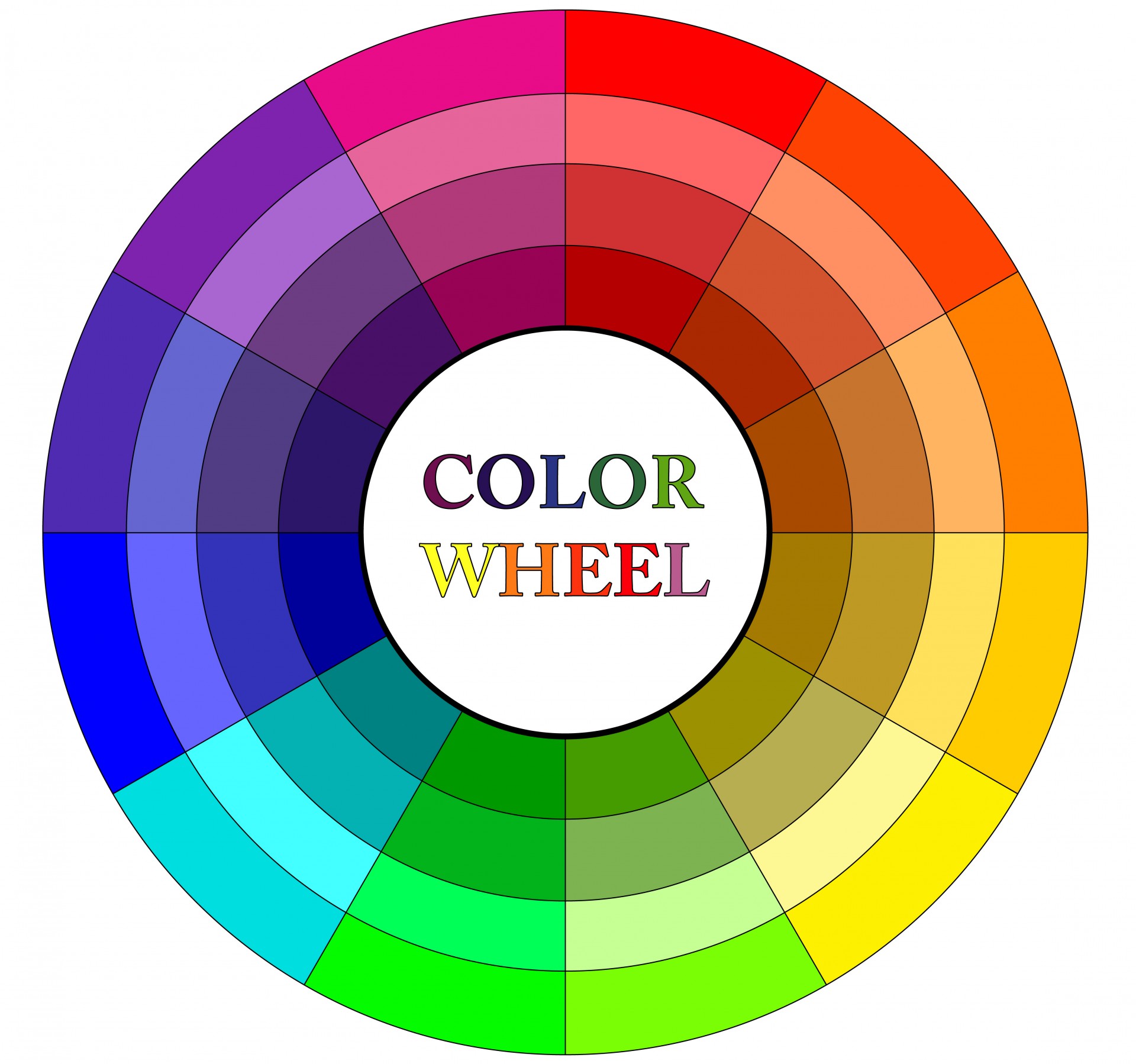
For instance, complementary colors (colors opposite each other on the color wheel) create a high level of contrast that draws attention to your design elements. Analogous colors (colors next to each other on the color wheel) help convey harmony and cohesion within your design.
Furthermore, different colors evoke different emotions or moods – red conveys passion or excitement while blue suggests calmness or tranquility. Understanding this psychology behind colors will enable you to tailor your designs accordingly.
In conclusion: mastering color theory is not optional if you want your work as a handy man designer appreciated by others; it’s essential!
Basic rules for creating color harmony
When it comes to creating color harmony, there are some basic rules that even the most handy of individuals should keep in mind. These guidelines can help you create a cohesive and visually pleasing color scheme for any project or space.
Firstly, consider the color wheel. Colors opposite each other on the wheel, such as blue and orange or red and green, are complementary colors that create a vibrant contrast when used together. Using these pairs can add energy to your design.
Secondly, stick to analogous colors – those next to each other on the wheel – for a more harmonious feel. For example, if you’re working with blues and greens in your design scheme then using shades of these colors will give off an effortless vibe while keeping things consistent.
Thirdly use triadic colors- which means 3 colours equally spaced apart from one another around the colour wheel e.g yellow-blue-red
Finally remember that balance is key! Use neutral tones such as whites or greys alongside bright pops of colour so they don’t dominate but rather enhance their surroundings.
By following these basic rules anyone can achieve stunning results when combining colours!
Using color psychology to enhance your designs
As a handyman who is skilled at fixing things, you understand how important it is to create designs that not only look good but also evoke the right emotions in your clients. This is where color psychology comes into play.
« blanket storage ideas
Eufy X10 Pro Omni Review: A Cleaning Revolution? »
Color psychology refers to the study of how colors can affect human behavior and emotions. By understanding these principles, you can use color to enhance your designs and create spaces that make people feel comfortable and happy.
For example, using warm colors like reds, oranges or yellows in a room creates an atmosphere of energy and excitement. These colors are perfect for spaces like living rooms or entertainment areas where people come together for social activities.
On the other hand, cool colors such as blues or greens create a calming effect which makes them ideal for bedrooms or quiet areas where relaxation is key.
It’s important to note that different cultures may have varying interpretations of certain hues so it’s critical to be aware of cultural differences when working with clients from different backgrounds.
By incorporating these color rules into your design work as a handyman – whether painting walls or selecting furniture pieces – you can help bring out certain moods within any given space. Ultimately leaving customers more satisfied with their newly designed homes!
The role of color contrast in effective design
As a handyman, you know the importance of having the right tools for the job. But have you ever considered how color contrast can be a tool in your design arsenal? Effective color contrast is crucial in creating designs that are both visually appealing and easy to read.
When it comes to designing anything from flyers to websites, choosing colors with high contrast will ensure that your message is clear and easily understood. For example, using black text on a white background provides maximum readability. On the other hand, using light gray text on a white background may look stylish but can make it difficult for readers with poor eyesight or reading difficulties.
In addition to improving readability, effective use of color contrast can also create visual interest and hierarchy within your designs. By pairing complementary colors or contrasting hues together strategically, you can draw attention to important elements while creating an overall harmonious design.
It’s important to keep in mind that not all users see colors in the same way due to varying degrees of color blindness or vision impairments. Designing with accessibility in mind by incorporating sufficient levels of brightness and saturation will ensure that everyone has equal access to information regardless of their abilities.
In conclusion, understanding how different colors interact and utilizing effective contrasts can greatly enhance any design project – from simple home repairs flyers all the way up through more complex website layouts – making them more readable as well as aesthetically pleasing!
Tips for breaking color rules and experimenting with unique color combinations
Are you a handy man who likes to experiment with unique color combinations? Do you find yourself constrained by traditional color rules and want to break free? Here are some tips for breaking those rules and creating stunning, one-of-a-kind designs.
Firstly, don’t be afraid to mix warm and cool colors. Traditionally, these colors are thought of as opposites that clash. But mixing them can create a dynamic look that catches the eye. For example, try pairing a warm orange with a cool blue for an unexpected pop of contrast.
Secondly, consider using complementary colors in unusual ways. Complementary colors are opposite each other on the color wheel (e.g., red and green). Instead of using them in their typical pairings, experiment with mixing two or more complementary hues together for an interesting twist on tradition.
Thirdly, don’t shy away from bold hues like neon or metallics. These shades may seem intimidating at first glance but can add excitement and energy to your design when used strategically.
Lastly, remember that there aren’t any hard-and-fast rules when it comes to color combinations – it’s all about experimentation! Trust your instincts and have fun exploring different palettes until you find one that feels uniquely yours.
Whether you’re painting walls or designing furniture pieces from scratch – breaking traditional color norms is key in creating exciting new works!
Conclusion
To make the most of color theory, you need to understand basic rules along with the role that contrast and psychology can play. With a better understanding of how colors interact, you’ll be able to create truly unique designs that stand out from the crowd. And if you feel like experimenting? You may end up inventing some brilliant new color combinations too! Why not give it a try today?


