Muted colors are having their moment, and it’s easy to see why. These subtle shades bring a sense of calm and sophistication to any space or wardrobe. Unlike their brighter counterparts, muted colors offer a timeless elegance that’s both versatile and inviting.
Whether you’re redecorating your living room or refreshing your closet, incorporating muted colors can create a serene and stylish ambiance. Think soft grays, gentle blues, and earthy tones that effortlessly blend with any decor or fashion choice. Ready to explore the understated beauty of muted colors? Let’s dive in and discover how these hues can transform your everyday life.
Understanding Muted Colors
Muted colors bring a calm, subtle sophistication to spaces. They’re versatile and timeless.

What Are Muted Colors?
Muted colors are toned-down hues. They lack the brightness of primary colors. Examples include soft grays, gentle blues, and earthy browns. These colors blend easily with various design elements.
How Are Muted Colors Created?
Muted colors are created by adding black, white, or gray to pure colors. This process reduces the brightness and intensity. Painters and designers use tinted or shaded versions for a subdued look.
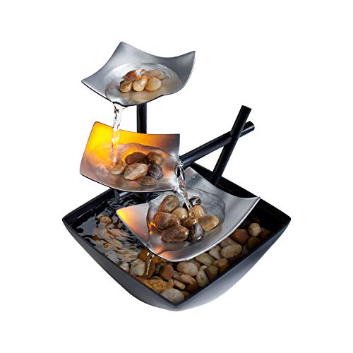
Applications of Muted Colors in Home Decor
Use muted colors for walls to create a serene backdrop. They also work well for furniture, providing a soft contrast. Muted colors in textiles, like curtains and rugs, enhance coziness. Accessories in muted tones tie the design together seamlessly.
Benefits of Using Muted Colors
Muted colors make spaces feel larger and more open. They are less overwhelming, creating a tranquil environment. These colors are also versatile, complementing various styles from modern to rustic. You’ll find that they enhance natural light, making rooms feel airy.
The Role of Muted Colors in Design
Benefits in Interior Design
Muted colors offer versatility in home design. They create a relaxing atmosphere. Soft grays, gentle blues, and earthy tones help spaces feel larger and more open. You can enhance natural light with these colors. They match various design styles, from modern to rustic. Use muted shades on walls, furniture, and accessories. Combining these elements can make any room feel cohesive and serene.
Impact on Branding and Marketing
Muted colors play a crucial role in branding. They convey sophistication and reliability. Brands using muted tones often appeal to a more refined audience. These colors can also evoke trust and stability. In marketing, muted shades create a timeless look. They stand out subtly without being overwhelming. Use muted colors in logos, websites, and promotional materials to project a calm, professional image.


Tips for Using Muted Colors Effectively
Using muted colors in your home design creates a calm, sophisticated ambiance. Follow these tips to make the most of muted tones.
Choosing the Right Color Combinations
Pair muted colors like soft grays, gentle blues, and earthy tones for a cohesive look. Choose a primary muted color and complement it with neutral shades. Use color palettes to guide your selections. For example, pair muted blue with beige or soft gray with warm cream. Avoid using too many colors to prevent a cluttered appearance.
Balancing Muted and Vibrant Tones
Add pops of vibrant color to create contrast. Use accessories, like pillows and artwork, to introduce bold hues. Limit bright colors to 10-20% of the space to maintain harmony. For instance, a muted gray room benefits from bright orange pillows or a colorful painting. Ensure that vibrant tones enhance, rather than overpower, the muted color scheme.
Examples of Muted Colors in Popular Media
Muted colors often feature prominently in many forms of media. They create specific moods and enhance storytelling.
Muted Colors in Film
Muted colors in film help set the tone for scenes. Movies like “Saving Private Ryan” use desaturated colors to evoke nostalgia and realism. Films like “Mad Max: Fury Road” use muted tones to underscore desolation. Documentaries also employ muted hues to maintain focus on content rather than flashy visuals.
Muted Colors in Advertising
« Top 10 Black and Decker Portable Air Conditioner Troubleshooting Tips You Need to Know Now
Can You Wash Your Pillows in the Washing Machine? Experts Reveal Surprising Tips and Tricks »
Brands use muted colors in advertising to convey sophistication and reliability. Apple’s ads use soft grays and whites to highlight product sleekness. Car manufacturers use muted colors to emphasize luxury and quality. Beauty brands employ muted palettes to underscore natural beauty and elegance.
Conclusion
Muted colors offer a unique blend of elegance and calm that can transform any space or brand. Whether you’re looking to create a serene home environment or a professional brand image these colors provide endless possibilities.
Their subtlety can evoke deep emotions and tell compelling stories in ways that bold colors often can’t. So next time you’re considering a design choice think about the understated power of muted colors and how they can elevate your project.
Embrace the beauty of these hues and let them work their magic in your creative endeavors.